Brand Insights
For Health Science Executives
Design Power: How Typography Creates More Memorable Communications
Design Power: How Typography Creates More Memorable Communications
Typography is much more than choosing a corporate font. It is the art of arranging text in a way that is both arresting and engaging. Done well, typography can make your next Biomedical, Biopharma or Life Science marketing campaign easier to read, relate to and remember.
Here’s how typography can make your Bioresearch Brand communications more memorable:
Well Executed Typography Draws In Your Audience
If you want to see the attention-getting power of typography, take a look at classic movie titles created by iconic designers like Saul Bass (Psycho, 1958) and Danny Yount (6 Feet Under, 2001). These artists used typography to create dramatic sequences and compositions that have left a lasting impression on millions of viewers.)
Sure, your bioresearch brand stories may not be as dramatic as Hollywood’s, but the rules for attracting and keeping your audience’s attention are the same. Whether animated or still, well-executed typography grabs the attention of viewers through techniques such as unexpected word placement, hand-crafted letters and interesting visual effects that bring the words into the surrounding scene. These nuances can communicate your concept much more than mere words on a page by making viewers think twice—or even three times—about what they are seeing.
“Typography is the use of type to advocate, communicate, celebrate, educate, elaborate, illuminate, and disseminate. Along the way, the words and pages become art.” ― James Felici, The Complete Manual of Typography
Whether a marketing communication will be viewed online or in print, putting typography center stage can help you break the mold of typical life science marketing campaigns and give your brand the stopping power it needs.
Typography Has the Power to Influence Your Emotions and Purchase
Have you ever chosen a book based on its cover or a bottle of wine based on the label alone? You may not have realized it at the time but, in both of these situations, typography plays a big role in influencing your emotions and ultimately your purchase.
The next time you’re in the airport book store just take a look at the wall of titles looking to win your affection and how many of them lead with type.
Book cover designer, Chip Kidd has made a career out of designing best-selling book covers with interesting and unique typography. In an interview with Smashing Magazine, he reveals the importance of presentation:
“The cover is your first impression. It’s the book’s face. Regardless of what kind of book it is, this is the way you’re going to visually preserve it first before you open it. What the cover should do is get you to open the book and start to read it and investigate it.”
The same could be said for almost any communication, because before people decide whether or not to engage with content, they do a quick scan to see how it is formatted and presented. If they like the feeling of what they see, they are much more likely to give it their full attention.
This behavior stretches beyond printed communications to almost every item we encounter in the world. Typography changes how we perceive everyday objects, and we look to them for clues about what we will and won’t like.
Wines are another easy example. Here, typography often takes center stage in garnering attention and persuading purchasing decisions. The wine inside many bottles may very well be the same quality and content, but from the label alone you have a definite take-away and make your selection based on how you plan to enjoy or share it. Arriving at a party with a bottle that is casual and friendly may be appropriate for one occasion while something more refined, sophisticated and even a bit mysterious more suiting for another. The wine you choose can be entirely based on the mood you are in when you buy it.
Ultimately, typography plays to a mood, sets the brand tone and has the power to help you influence the right people.
For Biomedical, Biopharma or Life Science marketers who occasionally feel boxed in by corporate standards, typography offers a safe way to step out of the mold without straying too far from core branding.
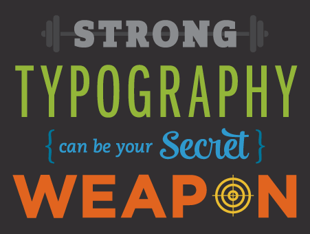
Strong typography can be your secret weapon for making information more arresting, attractive, and easy to read. And yes, even those boring corporate fonts can become works of art that make your audience pause.
Whether on its own or combined with another visual element, a typographic composition can bring the unexpected to an ad campaign or important communications such as an Annual Report, Case Statement, or Social Media campaign that must be attention-getting to be successful.
When typography goes beyond the basics of font choice and begins to incorporate more elements of style, such as spacing, direction, missing letters, emphasis and color, the resulting look can help you break out of a brand that’s become too routine.
Typography can also add weight and importance simply because someone has taken the time to “craft” the content into something more than words on a page.
This case study for Delta Airlines is a great example of a well-known brand using the power of typography. Here, corporate fonts combine with one that’s less traditional to amplify team spirit in a corporate responsibility program.
